


The German type: those pesky umlauts
Then the slack messages started to appear… “We’ve noticed the umlauts look strange on one of the headlines on the home page." Oh crap.


A story of diabolical diacritical marks and crafty compound words.
I’d just joined an Agency and my first project was a website design for a German start-up.
My new team had recently completed a brand re-fresh for them, including a visual identity and brand strategy.
I arrived just as the final concept had been signed off, and got thrown into building the brand guidelines. Fun! We presented everything and the client loved it.
Next, we rolled out the brand identity with a new website.
Because we’re an English speaking team, we partnered with a German web development agency to build our designs and translate our copywriting.
I’d insisted on getting professional translation done from the get-go because I know how nuanced the process is.
Years prior, I’d shared a co-working space with a corporate French to English consultant, and we’d often discuss and debate the best words and phrases to capture the original French sentiment.
It’s not as simple as chucking stuff into Google translate. Things like tonality, and clever word play get easily lost when converting to other languages.
Luckily, one of my co-founders had lived-in and been educated in Germany, so they were well placed to review the translators work.
Everything went smoothly, the client were lovely, they trusted us, and the partnership with the developer felt like a match made in heaven.
Things were coming along swimmingly. The first iteration of the site got approved and pushed live! Woo Hoo! High fives all round.
Then the slack messages started to appear… “We’ve noticed the umlauts look strange on one of the headlines on the home page.”
Oh crap.
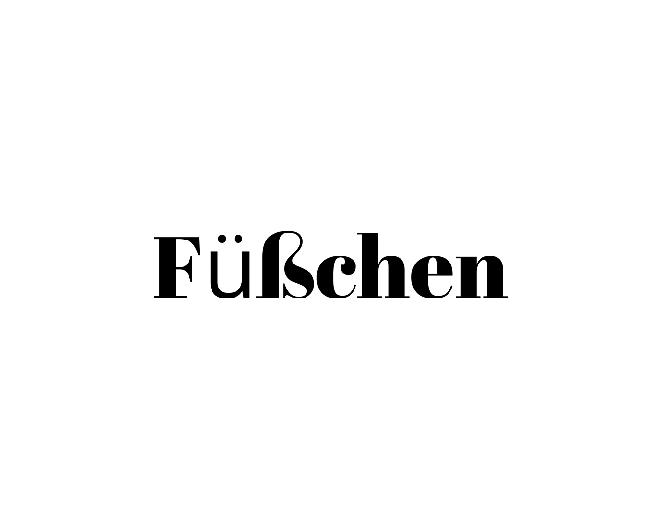
The body font was a beautiful utilitarian font that we’d licensed from a type foundry I’d used before.
It was very robust, with global language support. But the Display font we’d selected to pair with it was a licence free font (that had been used to create the companies new word-mark).
It was stylish, bold and elegant with softer edges that balanced out the harsher body font. It was perfect for headlines. Except… it only included basic letters. A-Z & 0-9. That’s it. No diacritical marks.
A quick lesson in diacritics: brought to you by Chat GPT
Diacritical marks (or diacritics) are symbols added to letters to change their pronunciation, stress, or meaning. They appear in many languages and can indicate tone, vowel quality, or other phonetic distinctions.
Some common examples include:
Acute (´) → café (French), José (Spanish)
Grave (`) → voilà (French), è (Italian)
Circumflex (ˆ) → hôtel (French), â (Portuguese)
Umlaut/Diaeresis (¨) → naïve (English), über (German)
Tilde (˜) → señor (Spanish), não (Portuguese)
Cedilla (¸) → façade (French), ça (French)
Macron (¯) → Māori (Māori), Tōkyō (Japanese romanization)
They are essential in some languages but often omitted in casual English writing, even when borrowing words from other languages.
Now back to the story
How the hell had we missed this? We had to act quickly, and our team spent the next 2 days creating all the missing diacritics needed to get this font up to scratch for the German language (and beyond).
We built these into a functional font file, and after a lot of testing and re-testing and adjusting to get it just-so, our developer uploaded it to the site.
Thankfully it worked!
We apologised to the client, citing a vague “bug” with the original font that we’d now fixed. (They didn't need to know the full extent of our stupidity).
They were happy with the fix, but ultimately the hiccup damaged the relationship.
Suddenly they became a little more critical of our suggestions. They asked more challenging questions, and things started to take longer to get approved. Everything was just a bit fractured.
It’s amazing how quickly doubt can creep in once someone makes a mistake.
That wasn’t the only problem on this project. Enter: Character length.
As I previously mentioned, we’re an English speaking team, and wrote all the website copy in English while we designed the website in Figma. So character limits, spacing decisions and the skeleton of the site design were all based on short and snappy English copy.
Our developer partner had been translating everything for us on their end after receiving our designs, and when the site went live, everything was a bit… well ugly.
Things didn’t look quite as considered as they did on Figma (which is always a challenge when moving from Design to Development) but more so than normal. We hadn’t accounted for the longer German words.
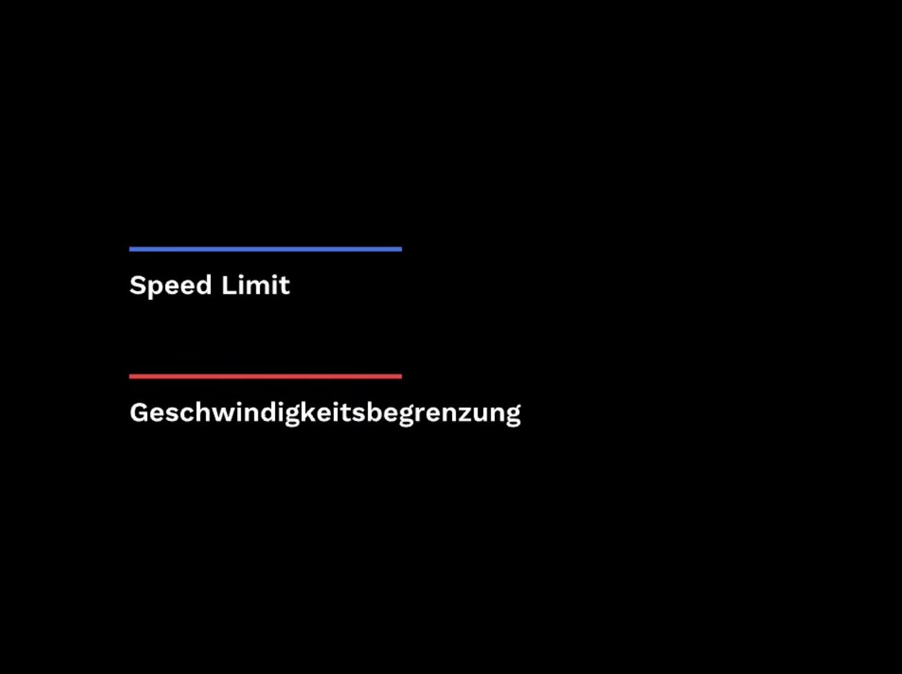
Typically, German is 30% longer than English due to longer words in general, the common use of compounding words, and other linguistic nuances like complex grammar. We didn’t design for this, so all the sections ended up bigger and clumsier on the final site.
It disrupted overflow, containers, layout balance, and hierarchy. Our design wasn't flexible or responsive enough to look good in both languages.
A quick lesson on German grammar: brought to you by Chat GPT
Compound Words (Längere Wörter)
German combines multiple words into one, whereas English often keeps them separate.
English: speed limit → German: Geschwindigkeitsbegrenzung
English: glove → German: Handschuh (literally "hand shoe")
English: job application form → German: Bewerbungsformular
English: airplane ticket → German: Flugzeugticket (or Flugschein)
These compounds can get very long, like Donaudampfschifffahrtsgesellschaftskapitän (Danube steamship company captain).
Right, lets wrap this up
The worst part is that I'd flagged the importance of translation early in the process.
We'd brought on a professional translator who worked closely with our German fluent co-founder to ensure quality was high. But I was so focused on the linguistic nuances, that I failed to consider the very basic mechanics of character length. And to be fair to them, the co-founder, translator and developer aren't designers.
Ultimately, we failed as a collective to adequately plan for this critical part of the project.
So what’s the valuable lesson from all this?
Know your Type. Not all fonts are created equal. For web design, always pick a type face that’s got robust language support. If you're lacking the budget to licence one, Google Fonts have a great range of licence free fonts that have robust language support (just make sure to pick one that has all the features you need. Some are much more basic than others). You can still use those obscure licence free fonts that you've collected along the way, but use them for things like the word-mark of a brand. Don't use them as primary and secondary fonts.
Build Responsive Websites. Seems obvious now. But you should always account for language variation in web design to ensure the build is responsive and flexible. It can be difficult to relinquish precise control of how something will look, but it's for the greater good. That eloquently crafted headline might look perfect right now, but taglines change with campaigns, things move on, and headlines need to be able to expand and contract in character length in the future without breaking the design. English or not.
Relationships Can Fracture Fast. This one's a life lesson not a design lesson. It goes for any relationships, not just clients. One mistake can break the trust in a relationship 10X faster than it took to build in the first place. If you take one thing away from this article, make it this.
So what now? (No, really. Help me out here!)
I’m genuinely blown away that (as I write this) 110 of you have subscribed since my first post (on LinkedIn). I wasn’t expecting that. And now that you’re here, I want to make sure this newsletter stays useful, interesting, and actually worth your time.
So tell me… what do YOU want to hear about next? What brought you here? What are you curious about?
This isn’t some “engagement hack” to boost reach. I really mean it. If I don’t hear from you, this whole thing risks becoming one long, self-indulgent monologue (and no one needs another newsletter).
So, drop a comment below and tell me: What topics would you love me to dive into? What challenges or curiosities do you have about design, creativity, or the messy reality of this industry?
Let me know! (Yes, YOU. I’m talking to YOU!)
Cool Links 🔗
KeironCalder.com ✌️ KenPlaylist.com 🪩 TheGoodWord.Club 💬 Health is Wealth 🧘
Banger of the Week 🚨
“I’m my own worst enemy. No-one can judge me harder than I judge myself.” - Your Mind by Greentea Peng